Indexer Status
Replacing a failing status page with chat-guided troubleshooting that decreased support tickets.
Role
Product Designer
Team
1 Product Designer, 30 Engineers, 2 Product Managers
Tools
Figma
Context
Built inside One Identity’s existing enterprise design system — the visual language, components and product chrome were inherited. The interaction design, conversational pattern, IA and the strategy shift behind it are mine. Worth judging on the problem framing and outcome rather than the surface aesthetics.
“Since this product is so complex, the idea of using a chatbot to assist users is revolutionary. I have not seen any other product do this. And it should be in every one of our products.”
My Design Process
A structured approach for a 30-engineer team
I created a design process diagram to help integrate design thinking into the engineering team. The process moved through Problem Space (Understand, Observe, Define), Solution Space (Ideate, Prototype, Test), and Develop Solution (Reflect) — with specific methods mapped to each phase.
Understand
W+H questions, problem framing
Observe
Usability studies, usage data
Define
JTBD, Red Routes, personas
Ideate
Engineers join from here
Prototype
Wireframes, high-fidelity
Test
SME review, customer testing
Understand
W+H questions, problem framing
Observe
Usability studies, usage data
Define
JTBD, Red Routes, personas
Ideate
Engineers join from here
Prototype
Wireframes, high-fidelity
Test
SME review, customer testing
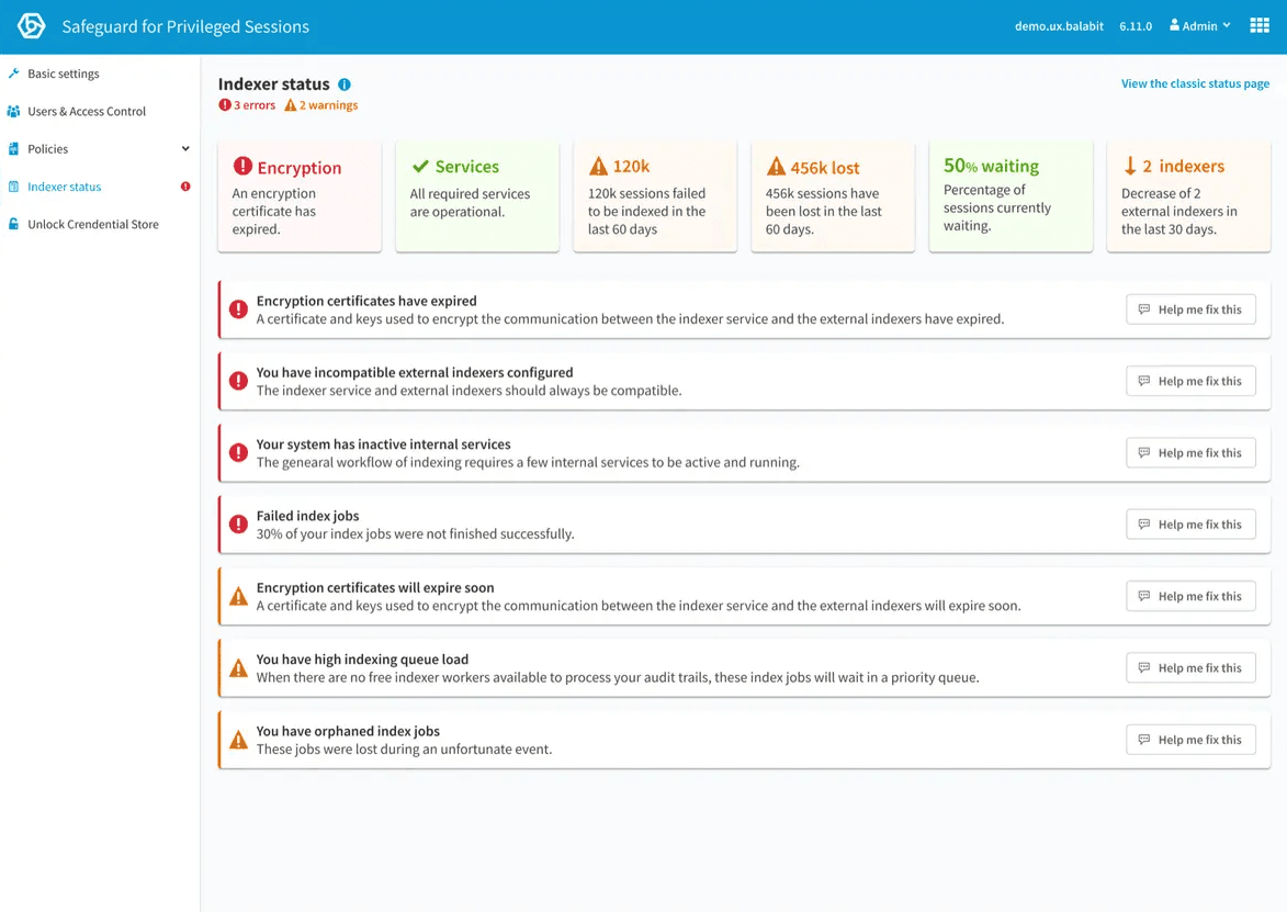
Understand
Existing page
The product team repeatedly received customer feedback that this page was not meeting their needs. After going through the feedback, it was clear that:
- Users were frustrated they were not getting notified of issues.
- It was difficult for users to see problems and then manually investigate and figure out the issues.
W+H questions help to gain new insights and information and start capturing the problem in a structured manner. This was completed as a workshop with the involvement of the Product Manager, sales and support, who regularly meet with customers.
Problem Statement
System administrators are failing to keep the indexing system operational due to a lack of information on the status of the indexing service, which is causing frustration and risk due to sessions not being indexed.
Design Principles
A list of design principles was made to define guidelines that constitute the framework for the team during a design thinking project.
Show priority quickly
Colourise items while considering accessibility.
Educate consequences
Help users understand the impact of issues.
Guide to a solution
Don't just show problems — help fix them.
Design modular
Accommodate iterations.
Jobs to Be Done
This helps to focus the design on adding value for the user to help them accomplish their tasks. By meeting with Product Managers, sales and support in a workshop, I can capture the customer tasks (jobs to be done) in a structured way to gain new insights which reveal hidden tasks which optimise the entire user experience.
Red Routes
I organised a workshop to prioritise the Jobs to Be Done into a Red Routes diagram to identify the hierarchy. This lets us quickly determine which tasks should take priority in the design.
I also got engineers involved at this stage to understand any difficulty implementing these tasks. This was important as it provided numerous occasions where tasks were impossible due to technical limitations, technical debt, time, and resources.
Observe
Personas
As access to direct customers was limited, Steven System was created. A fictitious character who represents a user and helped the team empathise when designing this feature.
This helps to visualise our users' goals, desires, and needs and share them with various teams while keeping a consistent understanding of a target group of users.
User Flows
Define
How might we help system administrators
to maintain the health and function of indexers,
so that no security incidents are missed?
Define Success
Due to the nature of this product being on-premises, it is challenging to define success without data and metrics. However, it was decided that we could measure the number of support enquiries to determine if there was a decrease in indexer-related issues.
Understanding the Existing Design
Understanding the existing design and determining whether user testing was performed was essential. I spoke with subject matter experts and support to understand how users currently use this page.
It was clear that many users do not use this page as it does not provide value. Feedback from users said the page did not provide useful information or help them maintain the indexer system by providing errors, solutions or prevention.
Understanding the Current Technical Restraints
During meetings with engineers, it was clear that not all of the Jobs To Be Done listed were possible when designing this feature. Getting engineers involved early at the ideation stage was vital to stay within the project's scope. This feature was also designed in a way that was future-proof for later iterations and additions.
Ideate
Brainstorming ideas
I took all of the research and started to create sketches and rough ideas for the design of this page.
It was clear from the Jobs to Be Done and Red Routes that there were three clear, distinct categories of tasks:
A temporary space for urgent errors and warnings that need immediate attention.
The system's health at a glance — quickly identify problems that may need attention in the future.
Performance information for long-term tasks like managing resources and maintenance.
However, it was decided that only the urgent and status sections would be included in the first release due to technical limitations.
First Ideation
I first started by exploring the information architecture needed to fulfil my previous research — laying out some simple alerts and brainstorming how we might display urgent information, health information and performance.
Design Challenges
Design Challenge #1
How do we manage cases with a large number of alerts — without scroll-in-scroll, empty space, or content shifting?
By placing the errors and warnings at the bottom of the health status, the design was improved by having:
- One scroll for all content.
- No shifting of content.
- No limit to the number of items.
Considerations: careful to not create technical debt by restricting the ability to add more content at the top of the page, bringing the errors out of view.
Design Challenge #2
How can we make it clear and intuitive that some errors and warnings are related to a corresponding health status?
Hovering a health status increases the elevation to indicate it is clickable. When clicking a health status, the user sees additional information, and the errors/warnings are filtered to allow users to focus on fixing issues relating directly to one single health status. This is achieved without any shifting of content.
I also added a hover state on related alerts/warnings when hovering on a health status tile. Considerations: for accessibility, we should indicate these health status tiles are clickable.
Problem Iteration
A new problem surfaces
During the ideation stage, it was clear that simply presenting users with problems does not improve the experience. After talking to support and other subject matter experts, it was clear that we needed a better approach to guide users to solutions.
The current situation forces users to manually find the problem and then search a knowledge base to try and find a matching issue. Only then can they go through the process of reading the document and following along with instructions. This was costing our business money in support tickets and frustrating users.
An additional problem statement was written
System administrators struggle to find solutions to indexing issues, resulting in frustration and an increased risk of system instability.
Ideating this new problem
With this new problem defined, I explored ways to also guide to a solution.
Final Design & Prototype
Test
External Window
This feature is due for in-person usability testing with customers. However, many interesting interaction design issues arose during the Chat-Guided Solutions prototyping, talking to subject matter experts and internal testing.
Results: we could not anticipate the size or number of windows. Users often preferred having many windows open at once. I added these features to meet this need for flexibility:
Move the Chat into an external window
External Chat window returns to source if closed
Auto-minimise Chat when window gets too small
Offers a toast prompt to move Chat to an external window
Links clicked in external Chat affect the source window
The Outcome
A design that changed how the company thinks about support
< 2 min
resolution time for common indexer issues
Reduced from 20+ minutes — administrators could self-resolve without contacting support
Eliminated the most common support escalation path
Administrators could self-resolve indexer issues without contacting support
Chat-guided troubleshooting adopted as a strategic pattern
Across One Identity's full product suite — not just Safeguard
Sparked a company-wide initiative to rethink support delivery
The traditional model of searching documentation was replaced by conversational, in-product guidance
As Richard Hosgood put it: “It should be in every one of our products.”