User View
"The best feature in the last 5 years" — redesigning user risk visibility for a product used by 80 of the Fortune 100.
Role
Product Designer
Team
1 Product Designer, 30 Engineers, 2 Product Managers
Tools
Figma
Context
Built inside One Identity’s existing enterprise design system — the visual language, components and product chrome were inherited. The interaction design, information architecture, flows and the design process itself are mine. Worth judging on the problem framing and outcome rather than the surface aesthetics.
“Your design is this product's best feature in the last 5 years. The User interface has gone way beyond... I am seriously impressed with your design skills and can't wait to see them make it into the product.”
My Design Process
Design thinking in a 30-engineer team
I created this diagram to show the design process to help integrate into the large engineering team and effectively promote a design thinking methodology.
Understand
W+H questions, problem framing
Observe
Usability studies, usage data
Define
JTBD, Red Routes, personas
Ideate
Engineers join from here
Prototype
Wireframes, high-fidelity
Test
SME review, customer testing
Understand
W+H questions, problem framing
Observe
Usability studies, usage data
Define
JTBD, Red Routes, personas
Ideate
Engineers join from here
Prototype
Wireframes, high-fidelity
Test
SME review, customer testing
Understand
Existing page
Safeguard is critical in maintaining privileged access security for enterprise customers. In response to customer requests and competitive analysis, we needed to enhance our user view capabilities to better support auditors and administrators in identifying high-risk users.
After gathering customer feedback, it was clear that:
- Competitors offered administrators and auditors the ability to see individual users.
- Not being able to do this affected our product's competitiveness and potential sales.
Problem Statement
When auditors want to see a user's risk or activity, they have to spend a long time doing multiple searches, making it difficult to find high-risk users with excessive privileges. This causes a higher chance that potential security incidents will be missed.
Design Principles
A list of design principles was made to define guidelines that constitute the framework for the team.
Highlight abnormalities quickly
Surface risk without requiring manual investigation.
Flexible investigation
Work across multiple users and time periods simultaneously.
Future-proof the design
Accommodate features and data sources that don't exist yet.
Jobs to Be Done
This helps to focus the design on adding value for the user to help them accomplish their tasks. By meeting with Product Managers, Sales, and Support in a workshop, I can capture the customer tasks (jobs to be done) in a structured way to gain new insights that reveal hidden tasks that optimise the entire user experience.
Red Routes
I organised a workshop to prioritise the Jobs to Be Done into a Red Routes diagram to identify the hierarchy. This lets us quickly determine which tasks should be prioritised in the design.
I also got engineers involved at this stage to understand any difficulty implementing these tasks. This was important as it provided numerous occasions where tasks were impossible due to technical limitations, technical debt, time, and resources.
Define
How might we help Auditors
to quickly understand user activity and risk,
so that they can manage high risk users with excessive privileges?
Ideate
Where should we home this experience?
The first brainstorming sessions highlighted our first decision. Where in the product can we integrate this experience? The first recommendation from the PMs and engineers was to create a new page.
However, I decided to explore ways to integrate it into our existing sessions page because:
- We would need to display user sessions to help auditors investigate a user's activity.
- Exploring sessions, users, and specific user sessions would be a more seamless experience if they were on the same page.
User Testing the Sessions Page
I ran in-person usability sessions with auditors and admins to test the existing Sessions page before redesigning it. The findings reshaped the entire information architecture decision.
75%
of participants did not find the session page
25% thought it was a list of searches — from usability studies of the existing sessions page
Design Challenges
Seven challenges that shaped the design
Design Challenge #1
How do we switch between filtering and searching on all screen sizes with a large search field — without shifting content?
The search is used for long complex queries so needs to be large enough to accommodate a lot of text.
After investigating the use of the filter mode, I discovered this is an alternative feature that is rarely used.
I explored ways to have the search and filters visible at the same time — this would mean people could learn complex search expression language while using simple filters. However this also creates a very complex experience to design and technical restraints meant I could not pursue this.
I decided to move the filter option to an icon above the table. This allowed a very clean experience and solved issues with small screens while maintaining a large search field and the option to use filters.
Design Challenge #3
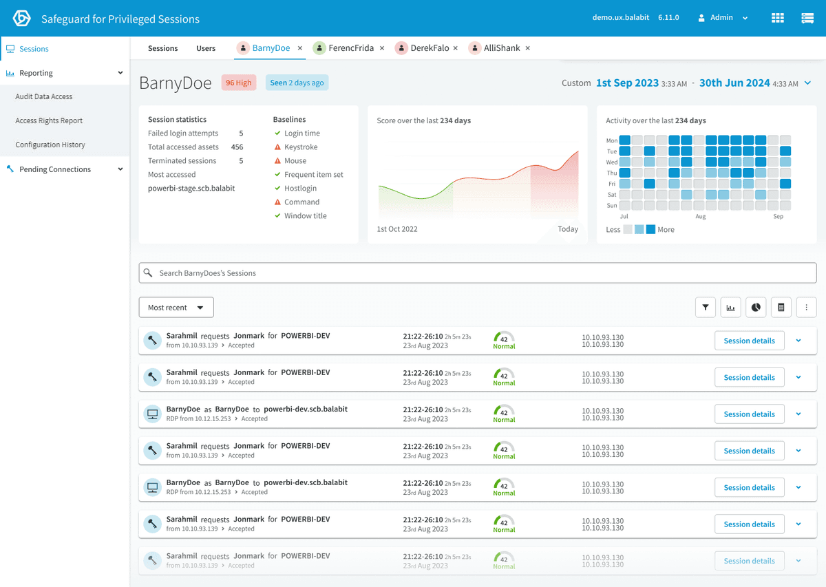
How can we highlight user activity and risk and allow users to quickly see increases and decreases?
- Activity heatmap — alongside the heatmap, there is a clear label of whether the user is Active and when they were last active.
- Risk graph — quickly identify the trend of the particular user risk. The score is categorized into three different levels of risk.
- Recent sessions of interest — quick glance at the last risky sessions that the user performed.
Design–Engineering Collaboration
Challenges in aggregating session scores into user scores
Aggregating session-based baselines into an accurate user score was problematic — consistent risky behaviour was often averaged out, failing to trigger high scores. We developed a weighted score aggregation to compare users against their peers and highlight significant behaviours:
Advanced Algorithm Weighting
Adjust scoring to give more importance to recent and frequent sessions. Ensures current risky behaviours have greater impact on overall score.
Trend Analysis
Examine user behaviour over time to identify patterns. Detects gradual increases in risky behaviour missed by individual sessions.
Contextual Analysis
Use additional data to understand the context of user actions. Differentiates benign from concerning behaviours, reducing false positives.
Anomaly Detection
Use machine learning to identify unusual patterns across multiple sessions. Captures subtle deviations from normal behaviour.
User Behaviour Profiling
Create detailed profiles that continuously update based on historical data. Detects deviations from typical behaviour.
Design Challenge #5
How can we use the tabbed navigation to seamlessly navigate between Sessions, Users and a User?
When opening a User Page, that Page is added as a new tab. This allows the user to open and investigate multiple Users simultaneously, save investigation progress and return to the Session Page and Users Page.
This fulfilled our design principle of enabling flexible investigation.
However, this poses a new problem in managing tab overflow.
Design Challenge #6
Should the date and time picker apply to all tabs?
Imagine investigating a User X and narrowing down a period of time when they did a specific activity. Then investigating User Y — only to find when you return to User X you have lost your progress because the date and time picker changes all tabs.
I decided to apply the date and time to only the currently viewed tab.
I also moved the date and time picker inside the page and used motion design to highlight the date and time change between tabs. This also helped solve Challenge #5 by giving the tabs much more space to prevent overflow.
Design Challenge #7
How can we enable users to easily zoom into a period of time using the visual graphs?
Solution A: I added an interaction where multiple charts show a hover state simultaneously and allow the user to click and drag/click a period of time, which updates the page's date and time range.
Solution B: I added a notification to communicate the charts can change the time period. I wanted to prevent the frustration of doing this accidentally and gently educate users about this feature.
Prototype
The shipped design
The full set of high-fidelity prototype screens — Sessions, Users, and the individual User view working together as a single investigation surface.
Responsive at smaller screen sizes
The Outcome
The biggest product update in years
4x faster
audit task completion during SME testing
Internal SMEs completed investigation tasks 4x faster than the previous workflow
Reduced average investigation time from ~12 minutes to under 3 minutes
During internal SME testing with sales, pre-sales, and support
100% of investigation tasks completable from a single view
Eliminated cross-page navigation during audits entirely
Most significant feature update the product had seen in years
Widespread praise from customers, sales, and pre-sales teams
Established the design process for a 30-engineer team
W+H workshops, Jobs to Be Done with MoSCoW voting, Red Routes, and design challenge documentation became the standard approach